Bicycle Space
Utilizing cycling as a catalyst for strengthening community
Bicycle Space is a community-centered bike shop, located in Washington, D.C. who values people as more than customers. Bicycle Space leads numerous social and educational events that bring the community together while celebrating the freedom of cycling.
Bicycle Space wants to encourage a greater sense of community for their customers. Currently, most of their community-oriented communication and activities are hosted on a Facebook Page. The site is outdated and needs some love.
“Biking provides me a sense of social freedom”
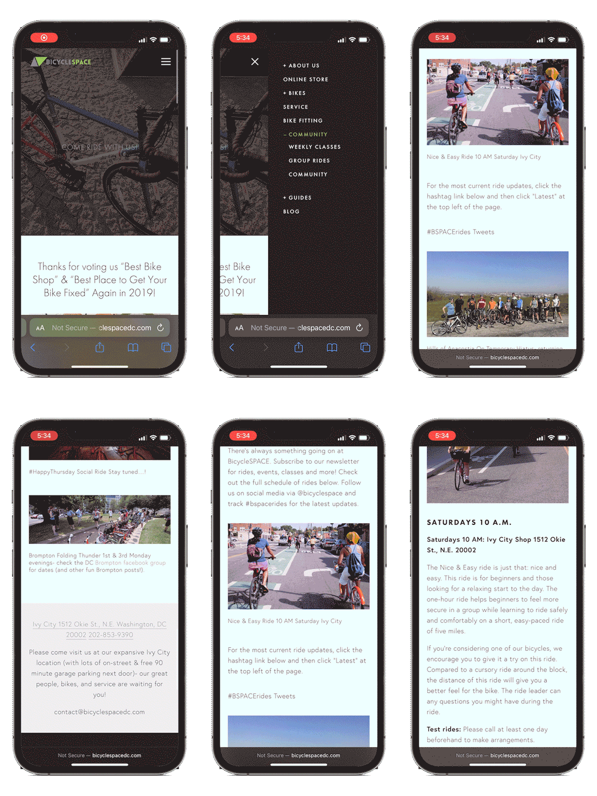
Current Website

Tools
Pen + Paper
Figma
Otter.ai
Smartsheet
Optimal Workshop
Google Suite
Role
UX | UI Research & Design Lead
Timeline
2 Week Sprint
Type
Conceptual Project
Discover
First, we conducted research on other bike shops in major cities and their local events. We evaluated features among their sites and found that all competitors had an events page with a section designated for previewing upcoming rides.
Then we orchestrated an element analysis which showed us that 84% of competitors had a designated shop page to sell bikes, accessories and merchandise. And lastly we found that more than half included not only a newsletter sign up but also a search bar in their primary navigation.

One approach that worked well on this project was screening users to qualify them before interviewing for user research. By utilizing surveys, we not only qualified users for additional research but collected key insight on their habits. This aided in our understanding of customer empathy and identified the users hesitations when committing to a group cycle ride.
We surveyed 13 participants who actively cycled 2 or more times per week
46%
Cycled 10 or more
times per month
54%
Cycled as a
recreational activity
85%
Agreed to a
follow-up interview
User Interviews
What We Asked
- What motivates them to cycle
- Preferences in riding solo, with a partner, or in a group
- Brand preferences
- Prefered cycling routes/terrain
- Current Apps they use related to cycling
- Loyalty or reward programs their local bike shop offered
What We Learned
- Like to be part of a community where they can foster connections
- Users prefer leisurely, self-paced riding events
- Majority of riders are concered about safety
- Cyclist view riding as a healthy activity to get outdoors
- Cyclers like to be aware of their route prior to and post ride
- Cyclists like to use digital tools to track their riding data
Define
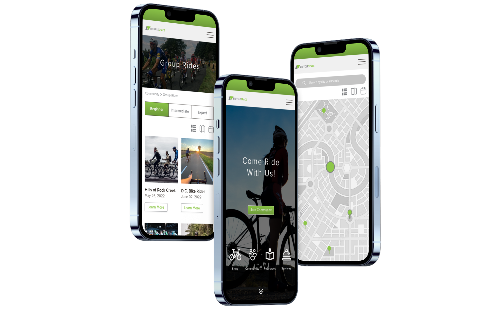
One of the challenges facing Bicycle Space’s commitment to building community, is their communication and ambiguity in event sign up. Early on it was understood that the uncertainty amongst users is an indication of a greater problem: Cyclists need a way to filter group rides based on skill level. Users want to feel confident in their commitment to join a cycling event, but often find themselves abandoning the website and looking elsewhere.
Hypothesis
By offering multiple access points to the Guides and Community pages, including filter options for group rides, and a newsletter subscription with a clear sign up call-to-action to stay up to date on latest news and discounts, it is believed our site can serve as an informational hub for users and thus enhance our community-friendly brand image.
User Persona
Behaviors
- Rides about 30+ mins per session
- Prefers paved, dedicated bike trails
- Seeks out new friendships
- Likes using digital tools to track his biking progress
Frustrations
- Unable to easily find local cycling communities to join
- Intimidated by his lack of knowledge on cycling
Motivations
- Forming connections & making new friends
- Learning as much as he can about his hobbies
- Wants to increase experience level

Design
After analyzing the research and looking at user personas, our approach was to synthesize the data and strategize as a team. We began concepting wireframe sketches, keeping our user needs and business goals aligned. We proceeded to redesign with the following goals in mind:

Visible Subscribe CTA
Quick Menus
Improve Navigation
Group Rides Page
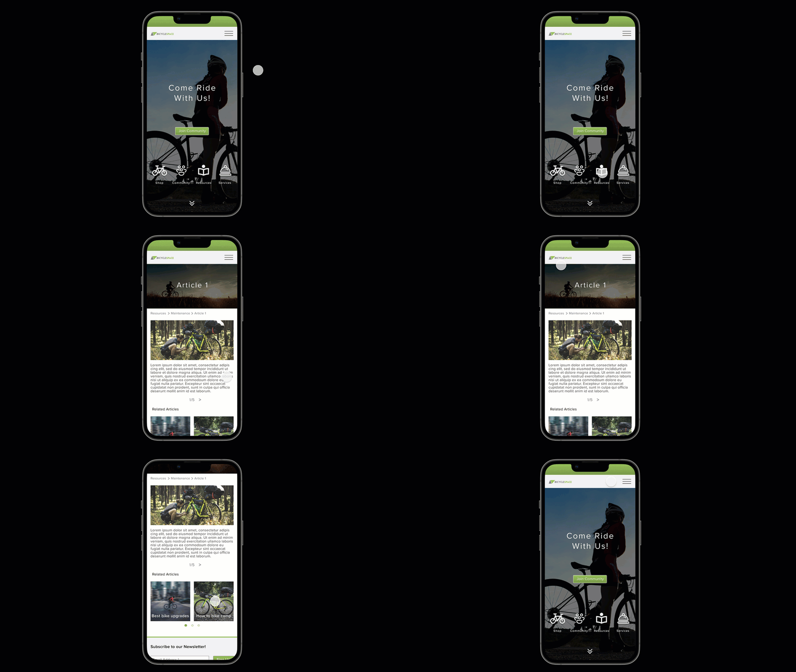
The victory of our efforts came after implementing visible call-to-actions for newsletter sign up, sidebar navigation, and supplemental navigation. In addition, during user testing we confirmed that applying quick menus on the homepage increased the speed of navigation and provided clear indication of site navigation. Also by providing breadcrumbs, users could easily identify where they are on the site.
Usability Testing
Task 1
Find an article related to bike repairs with less than 3 errors
- Changed “Guides” to “Resources”
- Changed “Bicycle” to “Shop”
- Changed service icon image
- Added CTA for articles in Maintenance & Repair page
Task 2
Find a group ride and RSVP for event in under 2 minutes
- Changed confirmation phrase
- Changed “Add to Calendar” CTA to link
- Changed “Back to Events” to “Back to Group Rides”

